

A useful Facebook sales post begins with a specific buyer question. Choose what readers need to understand, provide grounded information, then invite an appropriate next step: explore how it works, check an option, or ask a question before buying. The opening, image, and call to action should all serve the same question.
A practical sequence is the reader’s situation → useful information or an approach → evidence → the next step. This guide moves from a brief to three complete captions with matching illustrations, showing how to change the angle without changing the product facts.
1. Give the post one main job
“Write a sales post for the Facebook page” is too broad. Before choosing a hook, identify what the reader is uncertain about and which part the post will resolve. Someone who has not recognized a need requires a different introduction from someone asking for a price.
- Still identifying a need: describe a familiar situation and help readers recognize the problem.
- Exploring the product: show its use, suitability, and relevant limitations.
- Ready to choose: give confirmed purchase information and explain how to ask or order.
One primary job is usually enough. A post explaining how to fill in a weekly planner can end by inviting readers to try the layout. It does not also need a discount, a brand story, and a request to share.
The example brief
The situations, captions, and images below are illustrations created by Mạch Nội Dung for a fictional stationery shop. The example planner is defined as landscape A5, with seven day columns, a “Priority tasks” area, and no preprinted dates. It is not an actual product offer, real product photography, or a customer result.
- Reader: a small-shop owner who organizes the working week and writes tasks on separate scraps of paper.
- Need: see the week’s tasks together and choose what to do first.
- Available information: the defined size and layout, plus an example of how to fill it in.
- Missing information: price, sheets per pad, paper weight, suitability for different pens, stock, and delivery. Do not invent these details.
- Three jobs: recognize a need, understand how to use the planner, then assess whether it is worth asking about.
For a real post, replace the assumptions with product documentation, real photographs, and seller confirmation. For a service, the equivalent inputs are the work included, deliverables, delivery conditions, and scope limits.
2. Open with something the reader actually cares about
The opening should show what readers gain by continuing. It can be a question, an observation, or a product fact, provided the body delivers on it.
- Name the situation: “How many scraps of paper hold this week’s tasks?” Use this when the post explains how to gather tasks in one place.
- Start with an action: “Begin your weekly planner with the task that has the nearest deadline.” Use it for a practical walkthrough.
- Connect a feature to a need: “No preprinted dates: choose the week you want to start.” This suits readers looking for flexibility over when they use the page.
- Help readers choose: “Do you need a whole-week view, or more writing space for each day?” This opens a comparison of suitable layouts.
Unsupported: “One sheet of paper will completely transform your productivity!”
More specific: “Bring the week’s tasks onto one page, then choose what needs doing first.”
The revision describes an action the layout supports. The original promises a major result the brief cannot substantiate. Underline the opening’s promise and find the passage or image that delivers it. If none does, revise the opening or supply the missing information.
Not every hook needs to be a question. If readers are waiting for purchase details, go straight to the confirmed price, options, or applicable dates.
3. Explain benefits without exceeding the evidence
Use the sequence feature → supported action → relevant situation, stopping before outcomes you cannot establish.
- Seven day columns: tasks can be assigned to days and viewed together. That does not prove users will meet every deadline.
- No preprinted dates: users choose the starting week. There is no need to promise “never waste paper again.”
- A Priority tasks area: important tasks have a separate place. It does not establish a measured productivity improvement.
Match the evidence to the statement. A clear layout photograph can show seven columns; a filled-in example can explain use. Claiming that the paper works well with a particular pen needs suitable information or testing for that paper and pen. Attractive rendered artwork cannot replace a test.
Replace vague claims such as “premium,” “optimized,” or “exceptionally effective” with observable details. “The days sit side by side, with a separate priority area” gives readers something they can evaluate for themselves.
4. Make the call to action a natural continuation
A clear call to action explains what to do, where, and what information or benefit the next step provides.
- Recognizing a need: “Try gathering this week’s tasks on one page and marking what needs doing first.”
- Learning the method: “Add deadline-driven tasks first, then place the remaining tasks on suitable days.”
- Considering a product: “Message the page with the quantity you need to ask about price and availability.” Use this only when someone can handle the inquiry and provide the information.
If inviting comments, ask something that advances the discussion: “Do you need more room for daily tasks or general notes?” Be ready to read the answers. Requests to leave a dot or tag multiple people do not resolve the need in this brief.
One main action often makes a short post easier to follow. If you include both an information link and a messaging option, establish the order: check the specifications first, then ask about anything unclear. This is editorial advice, not a Facebook rule limiting the number of calls to action.
Consider stating a confirmed fixed price in the post. If price varies by quantity or configuration, explain what is needed for a quote. Do not hide available information merely to force comments.
5. Develop the caption and image together
Before preparing an image, finish this sentence: “After seeing it, the reader will better understand…” If the answer is unclear, the image may only be decorative.
- A post about scattered tasks should show separate notes and a layout that can gather them.
- A how-to post should show a filled-in page matching the tasks in the caption.
- A product-choice post should clarify the size, layout, or detail the buyer needs to inspect.
Let the caption explain what is hard to see and the image show what would take many words. Avoid copying the whole caption onto the artwork. Give the image one main focus, check text on a phone, and inspect cropping. For real products, use the correct model’s photographs; AI-generated images must not introduce unverified product features.
Meta’s announcement on spammy content discusses distracting captions, excessive hashtags, and captions unrelated to the image. It does not establish a word count or hashtag count that guarantees distribution. Keep the image and words on the same subject, using hashtags only when they serve a clear purpose.
6. Three complete posts from the same brief
These posts use the same fictional planner and audience. Each caption is complete; the commentary explains why its opening, image, and next step differ.
Example 1: Help readers recognize the need
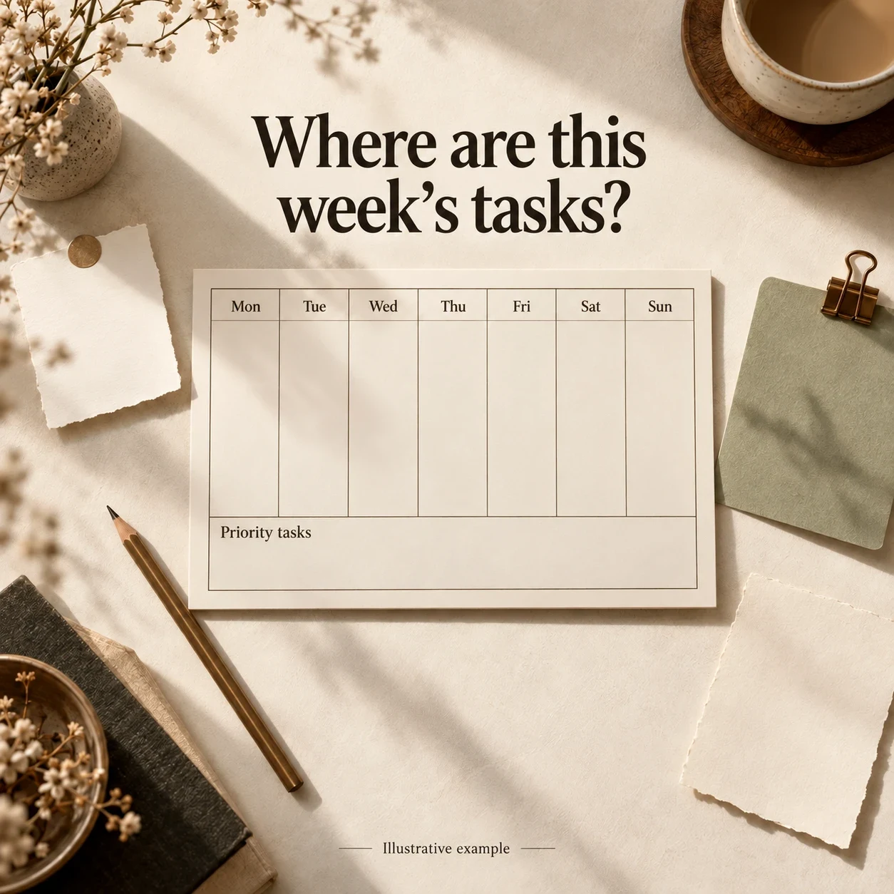
How many scraps of paper hold this week’s tasks?
One says to send a quote, another lists a post to draft, and a third reminds you to check stock. To see the whole week, you have to collect them from different places.
Try bringing them onto one page. Put deadline-driven tasks on the day they need doing, and add the most important item to “Priority tasks.” Look over the page before starting a new day to choose what comes next.
The landscape A5 weekly planner has seven day columns and no preprinted dates, so you can enter the week you want to start.
Today, try putting the week’s tasks on one page. You can draw a layout on paper you already have before choosing a printed version.
Why it works this way: the opening names a specific situation; the body offers an approach before introducing the layout. The loose-note image explains the problem, and the invitation to try a method suits someone still recognizing the need.
Example 2: Show how to use it
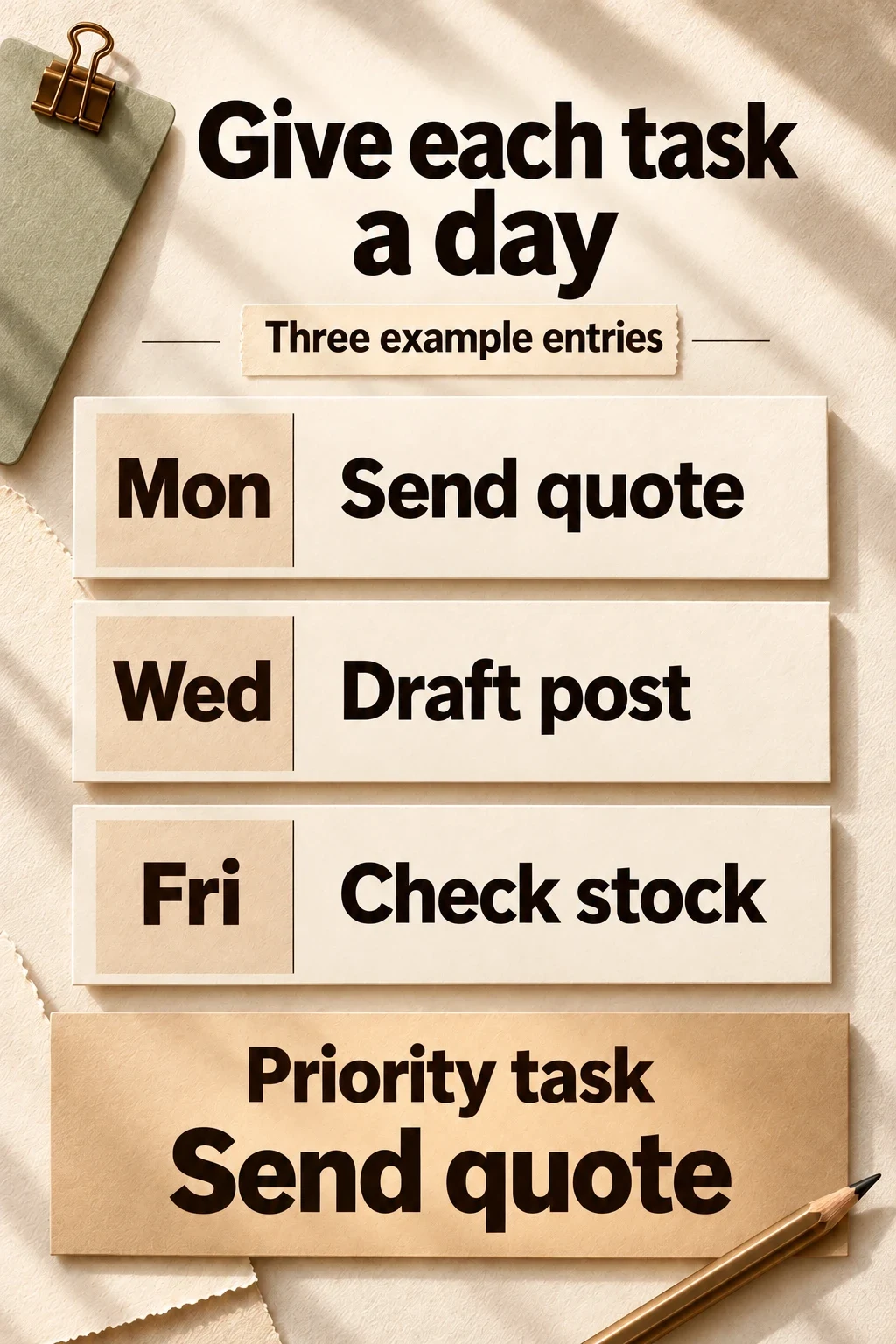
What goes on a blank weekly planner first?
Start with tasks that have deadlines, then add the ones with flexible timing.
In this example week, the quote needs to go out on Monday, the post is assigned to Wednesday, and the stock check to Friday. “Send the quote” also appears in “Priority tasks,” where it is easy to see when opening the page.
Seven days side by side let you see where tasks have been placed. Leave unplanned spaces blank; the page does not need to be filled just to look finished.
When a task moves, update the related notes too, so two different dates do not remain.
Try planning your own week in that order: deadlines first, flexible tasks next. Use the image as a simple starting point.
Why it works this way: the post answers “how do I use it?” through a sample week rather than repeating features. The image must match the Monday, Wednesday, and Friday entries. The call to action continues the method instead of abruptly demanding a purchase.
Example 3: Help interested readers ask the right questions
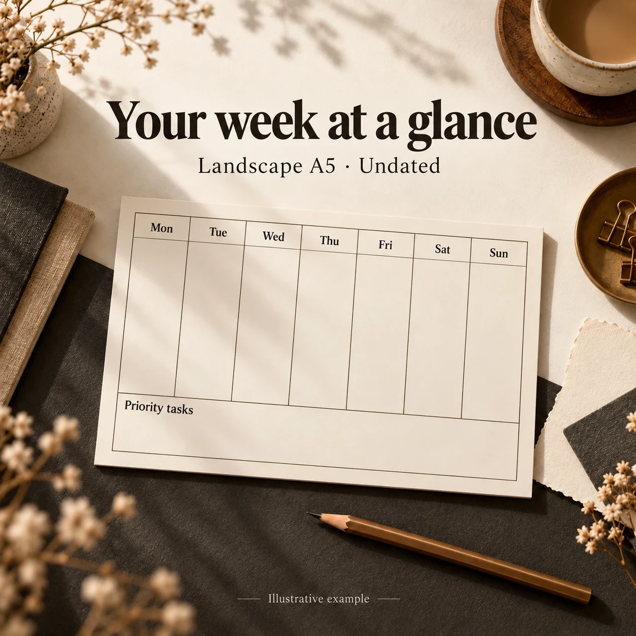
Do you need a whole-week view, or more writing space for each day?
If you usually note a task name and the day it needs doing, consider the landscape A5 weekly layout: seven day columns side by side, a “Priority tasks” area, and no preprinted dates.
This layout provides space for short notes. If you need meeting notes or a detailed hourly schedule, look at a layout with more room for each day.
Before choosing, write out a task at your usual length and compare it with the space in a column.
To ask about the landscape A5 version, message the page with the quantity you need. The shop will check price, pad format, and availability so you have the information before deciding.
Why it works this way: the post explains both suitability and limitations. The call to action states what to send and what the buyer will learn. It invites an inquiry rather than saying “order now” before price and purchase conditions are known.
For a real offer with complete information, include the price, pack format, ordering method, and applicable conditions. These examples are not a reason to omit important sales information.
7. Review before posting, then learn from the response
Read as someone unfamiliar with the product. Without the brand name, is it still clear whom the post helps and what it helps them do? Check:
- Opening: does the body answer its promise?
- Facts: are prices, features, purchase conditions, and claims supported?
- Benefits: do they follow from actual features or observations?
- Image: is the model correct, the information accurate, and the text readable on a phone?
- Next step: is it clear, with someone ready to handle responses?
- Destination: do the link, product page, and messaging channel work?
After publication, compare responses with the original job. For a tutorial, which step is still unclear? For a product-choice post, which specifications do readers still need? Repeated questions can guide the next clarification.
Interpret metrics in light of the objective and available data. Engagement alone does not prove sales; few comments do not establish that a tutorial was unhelpful. When comparing versions, record differences in topic, image, timing, and offer rather than attributing everything to the hook.
Start with one product, a short agreed brief, and one real question. When the opening, benefit, image, and invitation connect, the draft is clear enough to review and improve.
Mạch Nội Dung’s Facebook page content service can prepare posts and images and publish to an agreed schedule.